How UI/UX Design Impacts Conversion Rates: Data-Backed Insights

Introduction
A beautifully designed website that doesn't convert is like a billboard in the middle of a desert—visually impressive but ineffective. The ultimate goal of UI/UX design isn’t just to make things look good; it’s to guide users seamlessly toward an action, whether that’s making a purchase, signing up for a newsletter, or booking a service.
But what does "good design" actually mean in terms of conversions? How do real-world brands use UI/UX to drive results? Let’s break it down.
The Psychology of First Impressions
Think about the last time you landed on a website and left within seconds. Maybe it took too long to load, or the layout felt overwhelming. Research shows that users take just 0.05 seconds to form an opinion about a website. In those milliseconds, the design either builds trust—or drives them away.
Case in Point: Amazon’s Checkout Flow
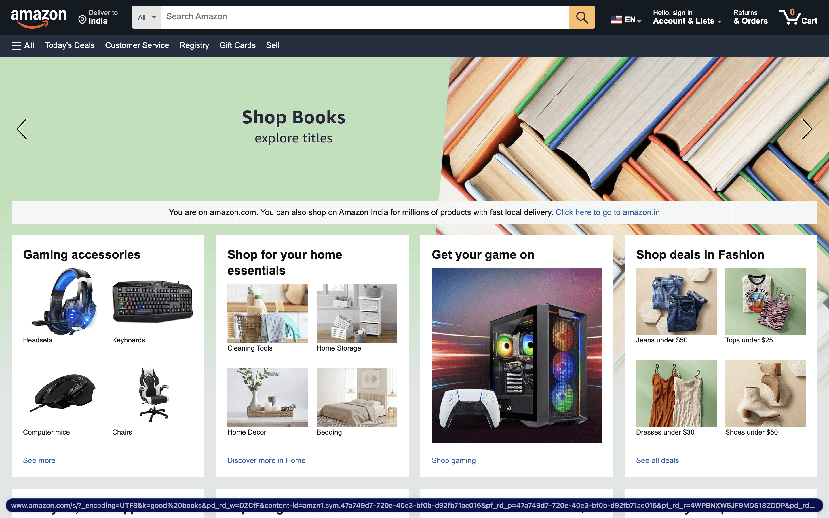
Amazon has mastered the art of reducing friction in online shopping. The company pioneered one-click checkout, removing unnecessary steps and minimizing the chances of cart abandonment. The result is a 35% increase in conversions simply by making the process feel effortless.
What this means for your design:
Users should never have to think too hard. The fewer steps, the better.
Reduce cognitive load by keeping navigation intuitive.
Use familiar design patterns—users shouldn’t have to "learn" how to use your website.
Why Speed Matters More Than You Think
We live in an era of instant gratification. If your website takes longer than three seconds to load, 53% of visitors will leave. Google even ranks page speed as an SEO factor, reinforcing the direct connection between speed and conversion rates.
Case in Point: Walmart’s Page Speed Optimization
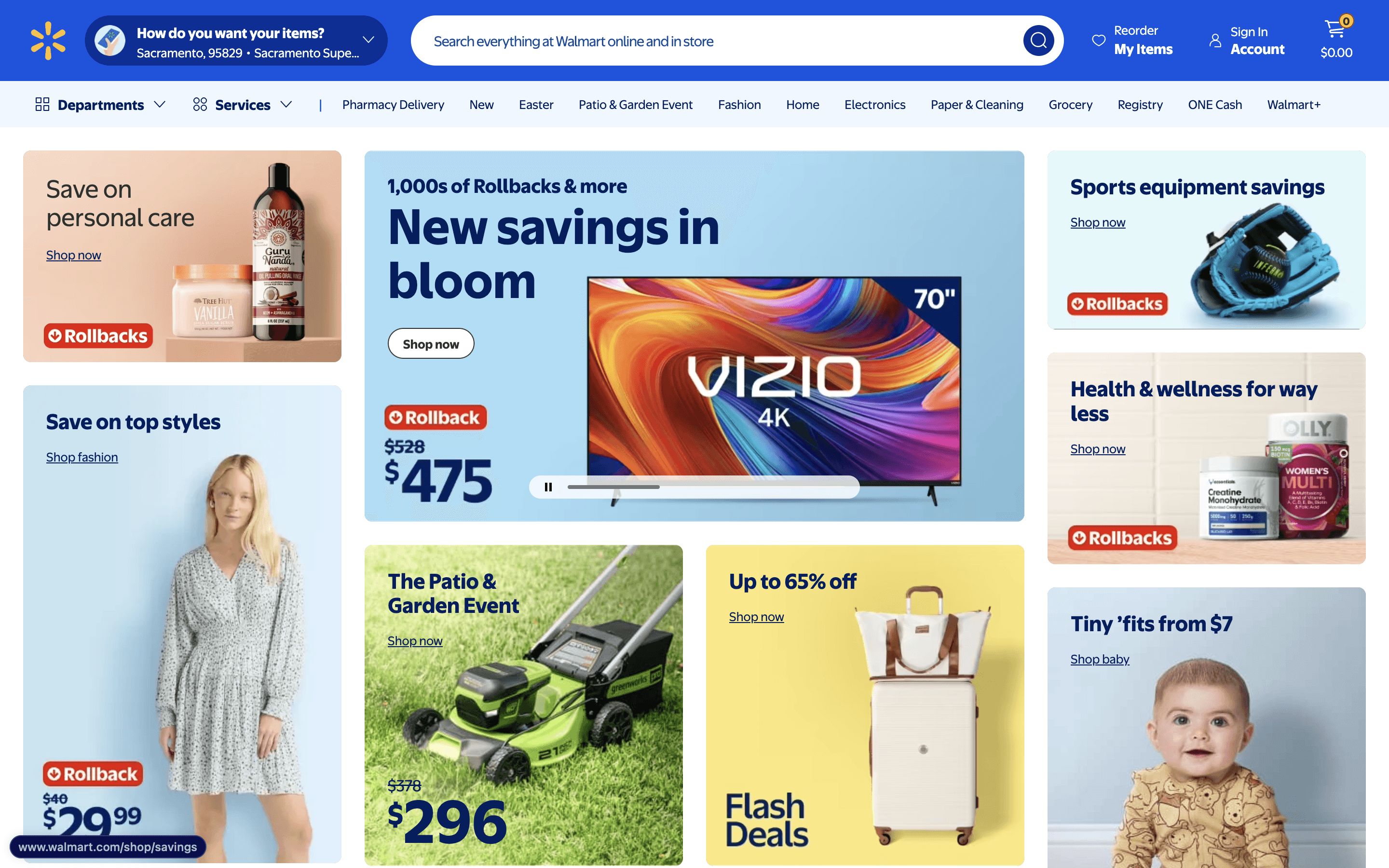
Walmart discovered that by improving page speed by just one second, conversions increased by 2%. It may seem small, but at Walmart’s scale, that’s millions in additional revenue.
How to apply this:
Optimize images and compress files to prevent slow load times.
Use lazy loading for assets that don’t need to appear immediately.
Implement a Content Delivery Network (CDN) to serve content faster across the globe.
The Power of Simple, Intuitive Navigation
Ever landed on a website that felt like a maze? Confusing navigation leads to 61.5% of users abandoning a site. Users should be able to find what they’re looking for with minimal effort.
Case in Point: Airbnb’s Search & Filtering System
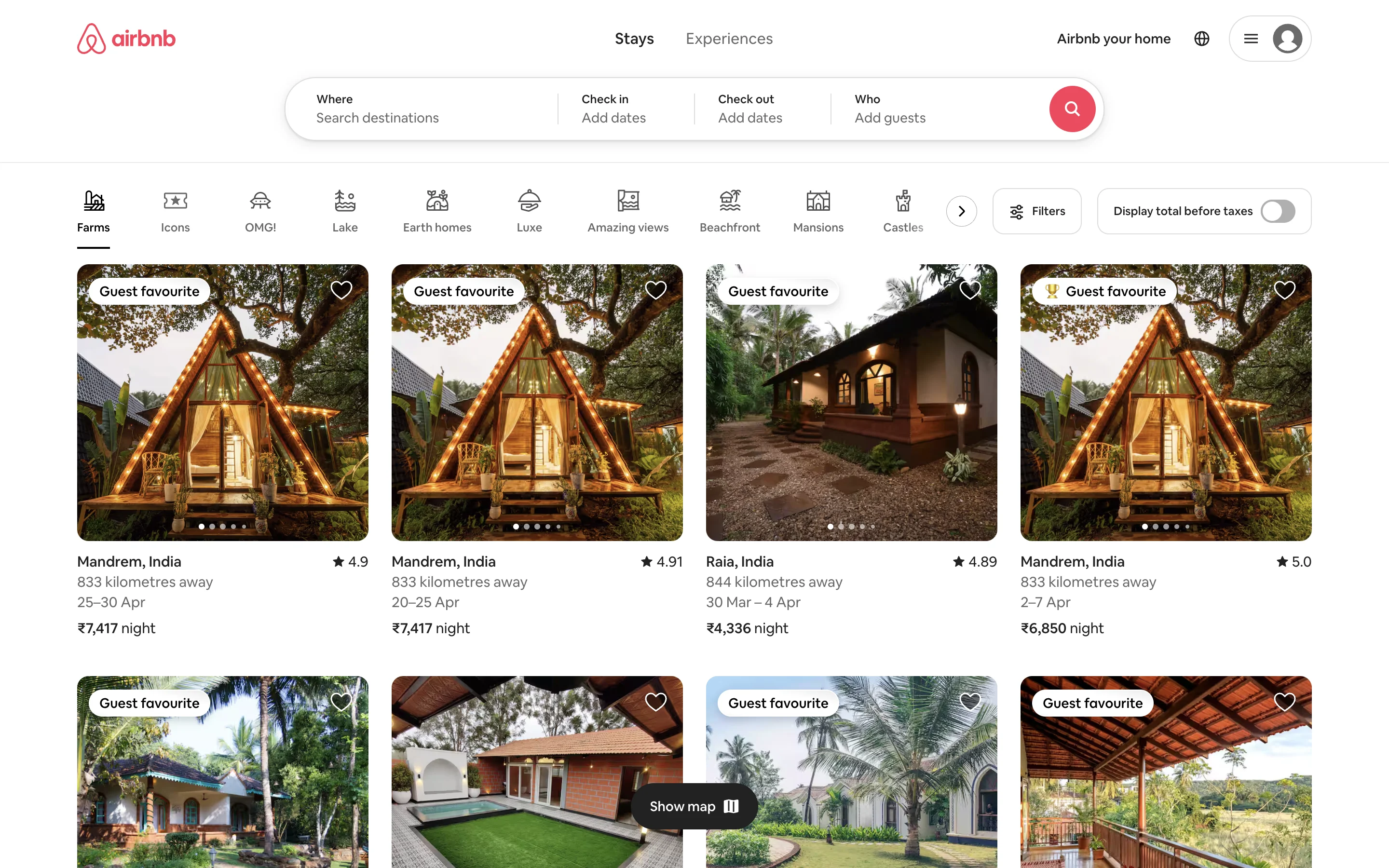
Airbnb’s entire business model relies on people finding the right stay quickly. Their UX team has perfected a search and filtering system that understands user intent. Instead of overwhelming users with options, Airbnb guides them with:
Auto-suggestions to reduce typing effort.
Intuitive filters that feel second nature.
Clear price breakdowns to avoid surprises at checkout.
Takeaways for your site:
Don’t overcomplicate navigation—stick to simple, familiar layouts.
Use breadcrumbs and sticky menus for easy access to key pages.
Think mobile-first—most users browse on phones, so ensure menus are thumb-friendly.
The CTA That Converts
A great Call-to-Action (CTA) is like a well-placed road sign—it tells users exactly what to do next. But where you place it and how you word it makes all the difference.
Case in Point: Dropbox’s High-Contrast CTA Buttons
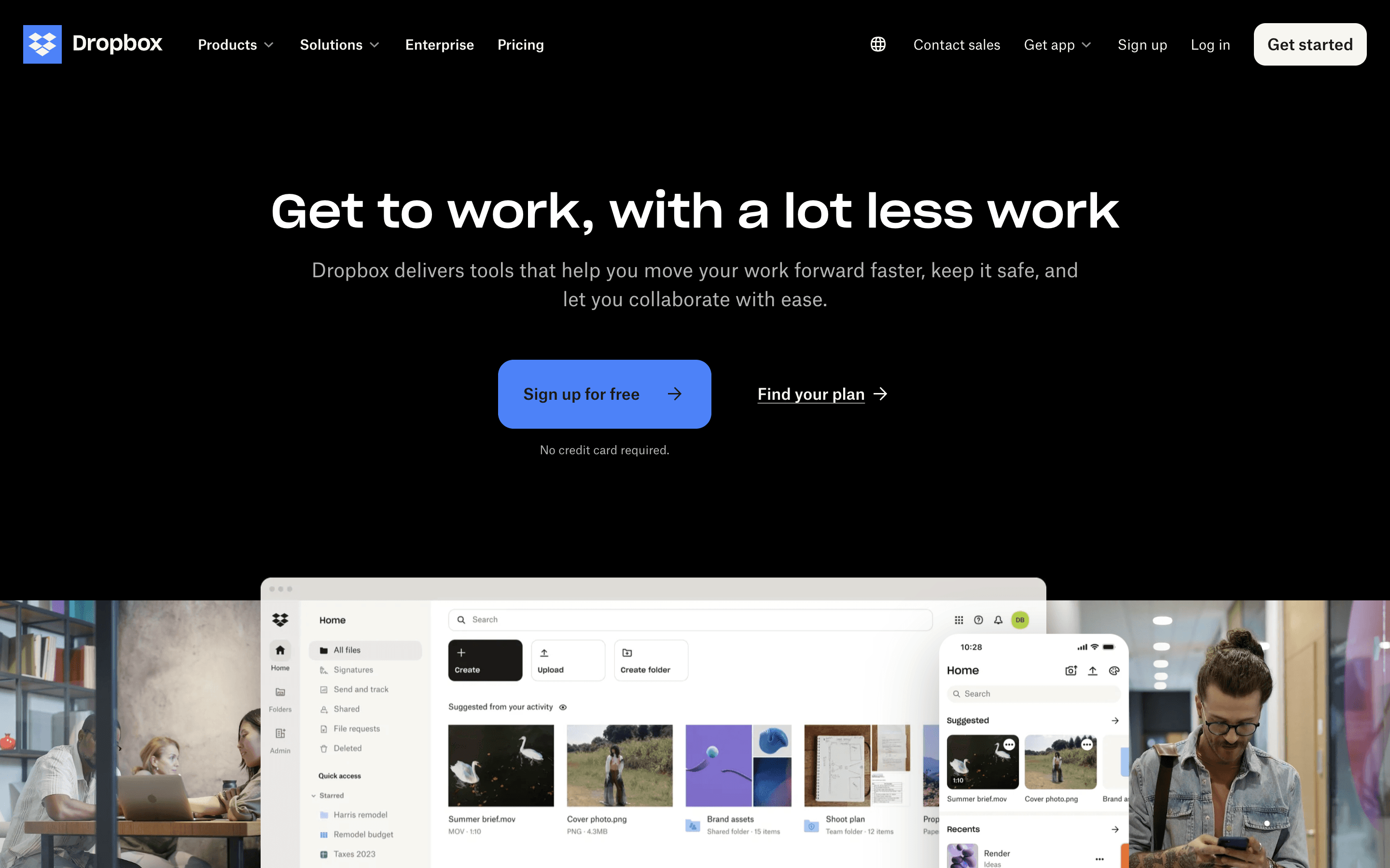
Dropbox improved sign-ups by 10% simply by testing CTA copy and placement. They found that a high-contrast button with action-driven wording (“Sign Up for Free” vs. “Get Started”) increased clicks dramatically.
What works in CTA design:
Color matters – High-contrast CTAs stand out more.
Action-oriented wording – "Get Started" works better than "Learn More."
Test different placements – Above the fold vs. at key decision points.
Alternative CTA Ideas
Below is a table of alternative CTAs that can be used instead of the commonly overused ones:
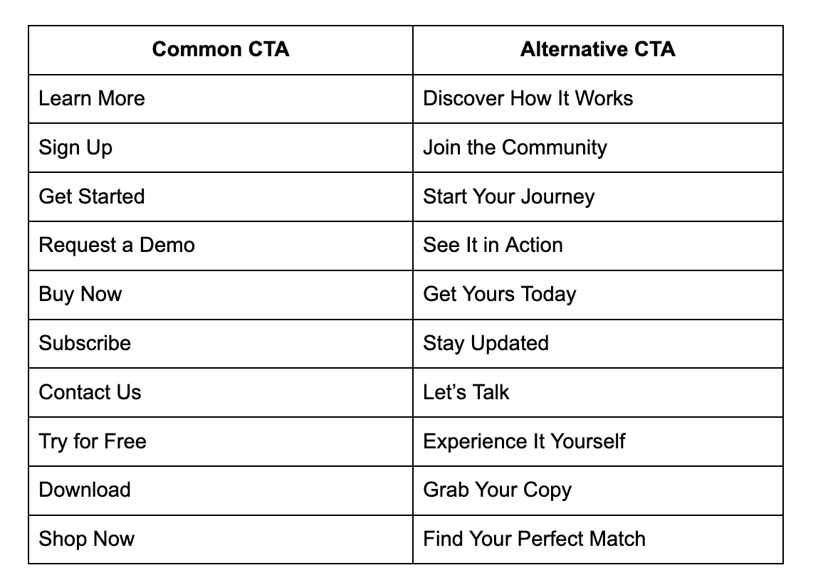
Using fresh, engaging CTAs can make user interactions feel more personal and increase conversions.
Mobile-First UX: The Non-Negotiable Factor
With over 60% of web traffic coming from mobile devices, a desktop-first approach is outdated. Google’s mobile-first indexing means that if your mobile UX is poor, your rankings and conversions will suffer.
Case in Point: Instagram’s Mobile-First Success
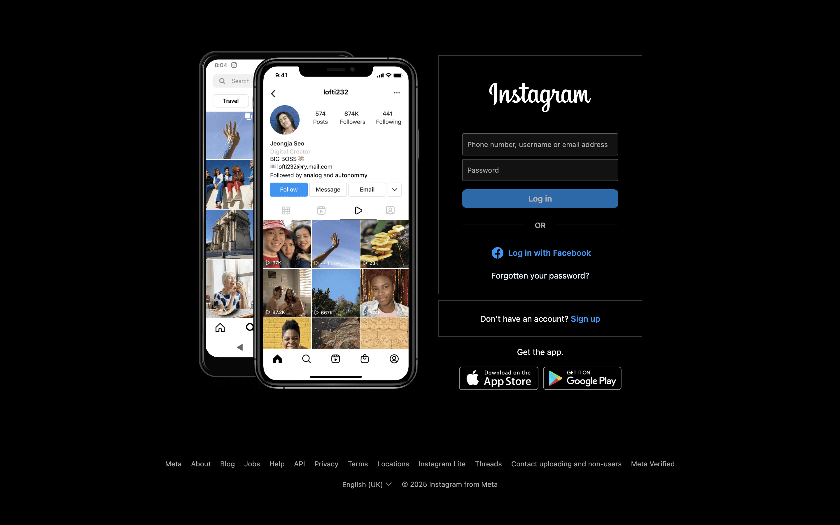
Instagram’s entire UI is designed for effortless mobile interactions. Swiping through Stories, double-tapping to like posts, and simple thumb-friendly navigation all contribute to its high engagement rates.
Optimizing for mobile conversions:
Design for thumb zones—users navigate with one hand.
Ensure buttons are large enough to tap without frustration.
Avoid long forms—autofill and one-click logins make mobile UX seamless.
The Future of UI/UX and Conversions
The best UI/UX isn’t just about making a site look good—it’s about making conversions feel natural. When users don’t have to think, when every step feels effortless, and when trust is built through design, conversions follow.
Final Thoughts:
Speed, clarity, and simplicity drive higher conversions.
Data-backed design choices make a measurable impact.
Small tweaks in UI can lead to massive revenue growth.
The numbers speak for themselves. The better your UX, the better your bottom line.


Let’s
Codesign
Contact us today for a free consultation and let your journey to success begin.